Practical examples: Symbology type
Unique Value
Point features can be visualized with a specific icon or symbol based on a unique attribute value. This symbology type is ideal for field containing the type, condition or state of a feature or a value which uniquely identifies it.
Our practical example uses the categorization by unique values to group kindergartens by their type. The map shows the values "katholisch" (catholic), "evangelisch" (protestant)," "Montessori", "Waldorf", "kommunal" (local) and "sonstige" (other). The visualization illustrates by the dominant representation of violet-colored icons that mainly Catholic-run kindergartens are located in the area of Trier, while other types occur underrepresented.

Another example would be the breakdown of schools by their school types (high school, junior high school, elementary school, etc.) or the visualization of restaurants based on the offered food (gourmet, vegetarian, italian, fast food etc.).
Class Breaks
Point features can also be distinguished by a graduated classification on the symbol size or symbol color. Both variables are dependent on the value of the selected atrtribute. The classification is suitable for fields that contain numbers and amounts or ratios.
In the example below, classes have been used to highlight the strength of the main hurricanes in 2005. The size indicates the prevailing wind speed and Saffir-Simpson Hurricane Scale at each location. Simultaneously, the color coding of the symbols shown the air pressure on the other hand. It is obvious that the air pressure is closely correlated with the storm speed.

There are manifold possible applications for classification. E. g. the frequency of use of bicycle parking facilities can be presented together with their capacity to make predictions about the utilization and development needs.
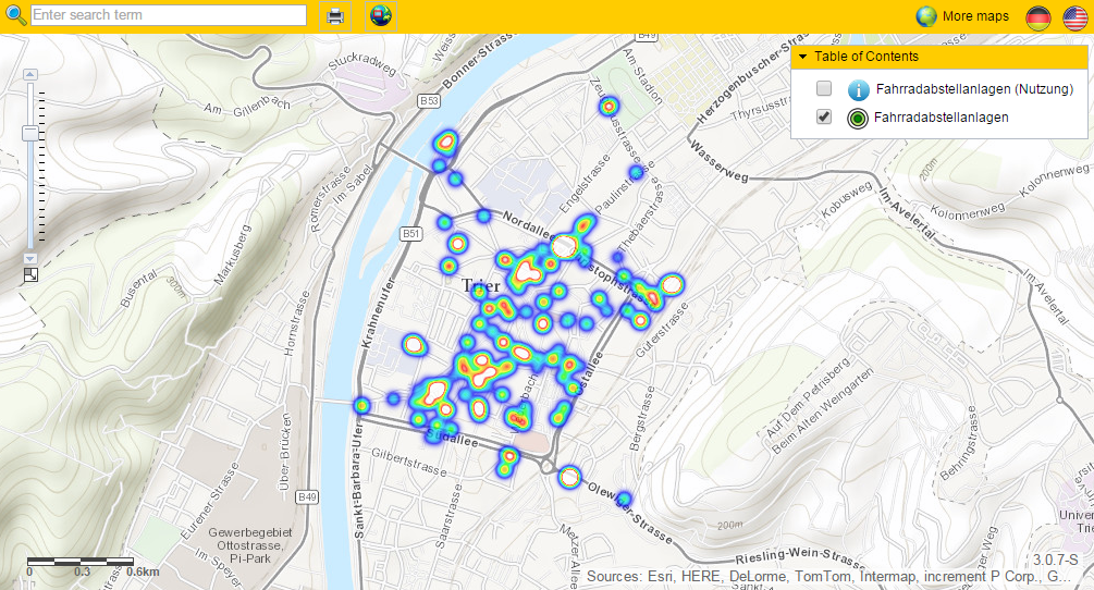
Heatmaps
Heatmaps provide information on the density distribution of an attribute in the map. For example, the population density of a large scale area or frequencies of shopping facilities can be visualized in a catchy way.

A different example shows bicycle parking facilities. In this case, it becomes clear that mainly Trier's pedestrian zone is equipped with those facilities, while the Moselle only partially owns capacities.